Official logos, colors, and usage guidelines.
QUESTIONS? Please contact Brent Tallent / Brand Manager
Please read logo usage guidelines below
PATH: Admin > Marketing > _Branding Assets
LOGO GUIDELINES
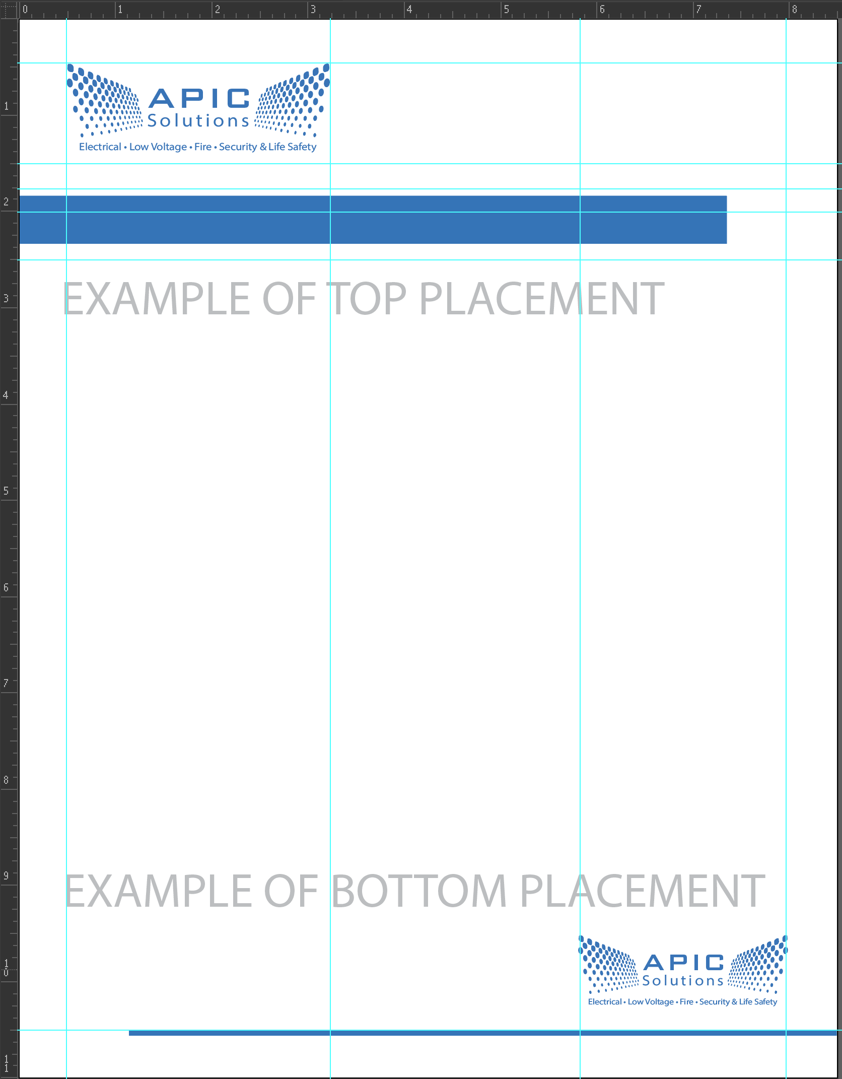
Logo PLACEMENT guidelines:
• Logo at top of screen should be left aligned
• Logo at bottom of screen should be right aligned
• Logo should only be centered if it's the only graphic on a page, or combined with 3 or less lines of text (eg. announcement, name badge)
Logo SIZE guidelines• Logo should never be larger than 1/3 the width of a page and most often should be 1/4 or less of the size of a page. However, it should never be less than 1/6 the size of any page
Logo Margin SIZE guidelinesthe margin around the logo should always be 1/2 the height of the logo. So if the logo is sized to be 1.5 inches, the margin around should be .75 inches.
Energy Bar Guidelines
Whenever practical, use the blue energy bar with the main APIC Blue color (shown above)
Logos with other Logos
Logos should never be placed with other logos unless for the goal of expressing a partnership. In cases of partnership, ideally the APIC Solutions logo is placed in the first left position and is equal in size or larger than other logos.
Alignment to the logo
When aligning text below the logo...
align to the lowest dot on the left
When aligning text above the logo...
Align to the highest dot on the left (or right)
LOGO DON'Ts
Logo PLACEMENT guidelines:
• Logo at top of screen should be left aligned
• Logo at bottom of screen should be right aligned
• Logo should only be centered if it's the only graphic on a page, or combined with 3 or less lines of text (eg. announcement, name badge)
Logo SIZE guidelines
• Logo should never be larger than 1/3 the width of a page and most often should be 1/4 or less of the size of a page. However, it should never be less than 1/6 the size of any page
Logo Margin SIZE guidelines
the margin around the logo should always be 1/2 the height of the logo. So if the logo is sized to be 1.5 inches, the margin around should be .75 inches.
Energy Bar Guidelines
Whenever practical, use the blue energy bar with the main APIC Blue color (shown above)
Logos with other Logos
Logos should never be placed with other logos unless for the goal of expressing a partnership. In cases of partnership, ideally the APIC Solutions logo is placed in the first left position and is equal in size or larger than other logos.

APIC Solutions Letterheads, Quotes, & Proposals
Virtual Sets for Teams Calls
Email Signatures
FONT USAGE
Myriad Pro or Calibri (Main Font)
Heading, paragraph, and "Solutions"
Myriad Calibri font sizes:
Paragraph = 8, Heading 1 = 34, Heading 2 = 21, Heading 3 = 13, Caption/Footnote = 5
Morris Sans Pro
"APIC" when displayed with logo only (no other uses)
Eagle Horizon
Hand written font
SuperClarendon
Announcement font for HR or Social Media

COLOR USAGE
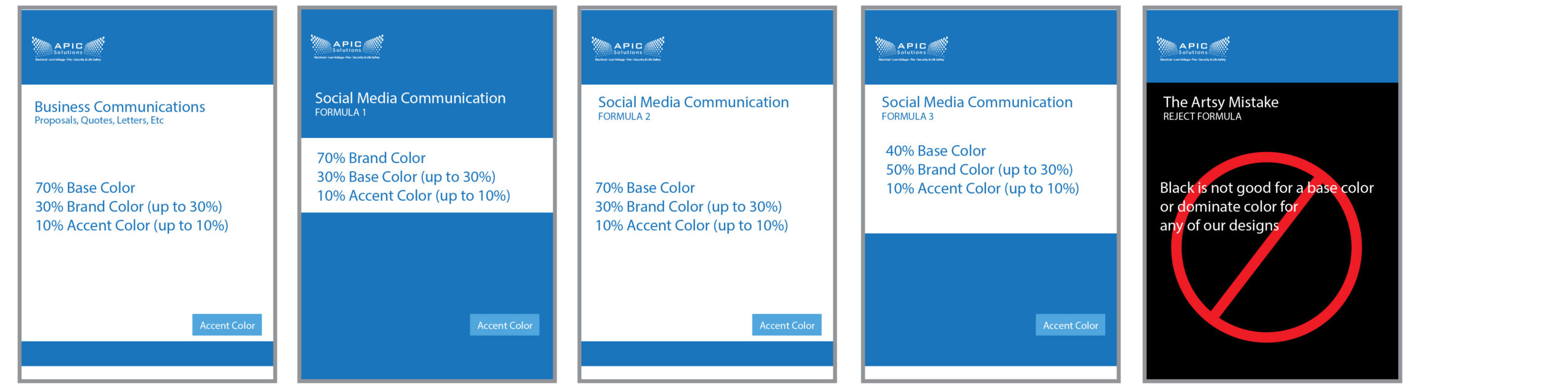
Brand Color, Base Color, and Accent Colors need to follow some easy proportions
APIC BLUE
RGB for Digital Usage
RGB=#1b75bc
R=27, G=117, B=188
CMYK for Print Usage
C=85%, M=50%, Y=0%, K=0%
APIC WHITE
RGB for Digital Usage
RGB=#FFFFFF
R=255, G=255, B=255
CMYK for Print Usage
C=0%, M=0%, Y=0%, K=0%
APIC ACCENT BLUE 1
RGB for Digital Usage
RGB=#50a6dc
R=80, G=166, B=220
CMYK for Print Usage
C=64%, M=21%, Y=0%, K=0%
APIC ACCENT BLUE 2
RGB for Digital Usage
RGB=#13496b
R=19, G=73, B=107
CMYK for Print Usage
C=97%, M=71%, Y=36%, K=21%
APIC DARK GRAY
RGB for Digital Usage
RGB=#5d5d5d
R=93, G=93, B=93
CMYK for Print Usage
C=62%, M=54%, Y=53%, K=26%
APIC SOFT WHITE
RGB for Digital Usage
RGB=#ebebeb
R=235, G=235, B=235
CMYK for Print Usage
C=7%, M=5%, Y=5%, K=0%
AI USAGE
AI is a great tool for creating mockups, brainstorming ideas, and other. Once you've completed your brainstorm, please send it to marketing manager for final tweaks.